CD-Sprint 1: getting excited about the brand
Our framework for the first week is to focus on the brand map as well as the brand strategy and related initial design principles. We started with a brainstorming session, so called “the first burst”. That implies answering questions like “what do we need”, “what are the blockers”, “what does success look like” and “what are our design principles”, including capturing “governance” and “risks”.
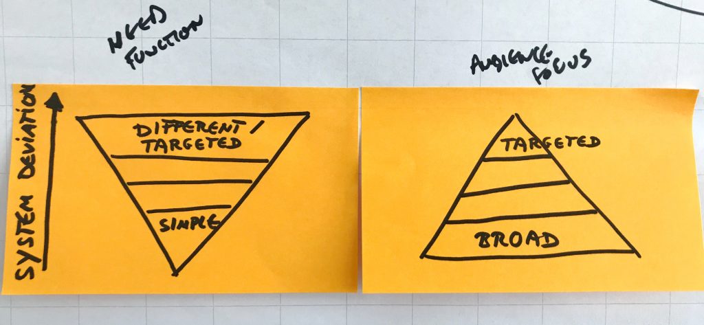
First outcome: EMBL-Design-Auditing-System:
the system shows two pyramids, side by side, right pyramid top down.
The left pyramid indicates the need and the function of the communications material: the lower pointed in the graphic, the simpler the design, the closer to the core brand design system. The higher up the more deviation from the design system and the more targeted and specific for the audience.
The right pyramid stands for the audience and the focus. The lower pointed in the graphic element, the broader the audience. The higher, the more specific the audience.

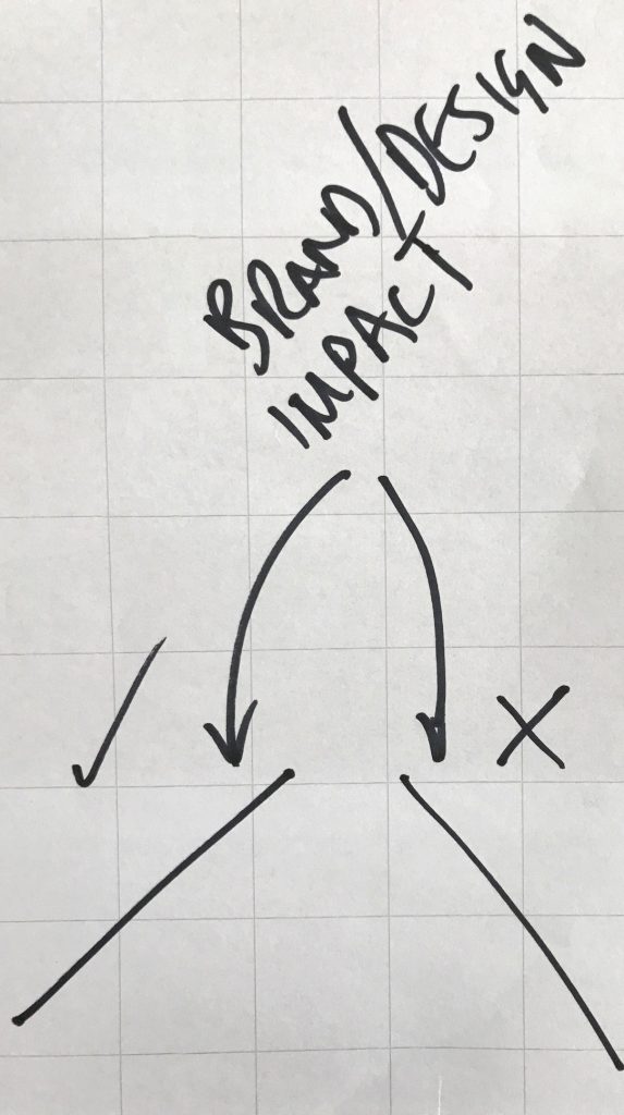
After some testing we realised: the more impact the campaign or product, the steeper the line. That means this is a very visual driven, easy and clear indicator of the impact on your audience as “good” or “bad”. The line is basically like an indicator-needle: going up = positive, going down = negative.

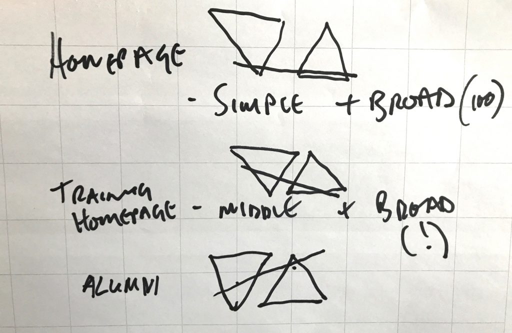
Here are some examples, based on current communications material:

Follow us to learn more about the process of building EMBLs brand.