Joining the design sprint
I’ve spent my first month at EMBL settling in, meeting talented people, and working out how the various digital projects that StratComm has planned will fit together.
We have a whole host of digital objectives – revamping embl.org, improving the intranet, fixing Search, creating a unified theme for EMBL websites, making EMBL services easier to navigate, to name a few – and they overlap and interact in various ways.
A key part of building a clear digital identity for EMBL will be robust, consolidated branding.
This month I was lucky enough to spend time on a Design Sprint led by EMBL Art Director Tabea Rauscher. Tabea leads the design team here in Heidelberg, and works closely with EBI Senior Graphic Designer Spencer Phillips and Web Design Architect Ken Hawkins.
Goals
We wanted to test the EMBL logo and corporate colours in various media, and think about how the EMBL brand could be adapted to work for assorted digital tools. We hoped that the sprint would help us better to understand strengths and weaknesses of our chosen typography, colours and visual elements.
Logo and colours
I spent a morning shadowing Tabea, who tested the EMBL logo in various configurations and combinations against different backgrounds and colours. I was struck by how much of a designer’s work is to solve problems in a structured and analytical manner. Graphical elements that work well online can fail in print and vice versa.
One example of a design problem to solve is how and where to incorporate sub-branding for EMBL’s various sites. At a recent Heads of Units meeting, management and key stakeholders agreed that the brand strategy should be “EMBL First”, with EMBL’s sites as sub-branding. This creates a visual problem: “EMBL Rome” and “EMBL – European Bioinformatics Institute” look very different on the (web)page. How to integrate these sub-brands? Work is still in progress.
Read Tabea’s account of this sprint
Posters
Spencer tested EMBL branding, typography and templates for various text-heavy poster options. How does typography work at various sizes? Which typography hierarchy is most effective, allowing readers to quickly scan the information they need? Spencer’s work gave us strong options for poster templates, and led to discussions on typography, and the idea that the Fira typeface may need to be tweaked to fit the needs of EMBL designers.
A toolbar for EMBL?
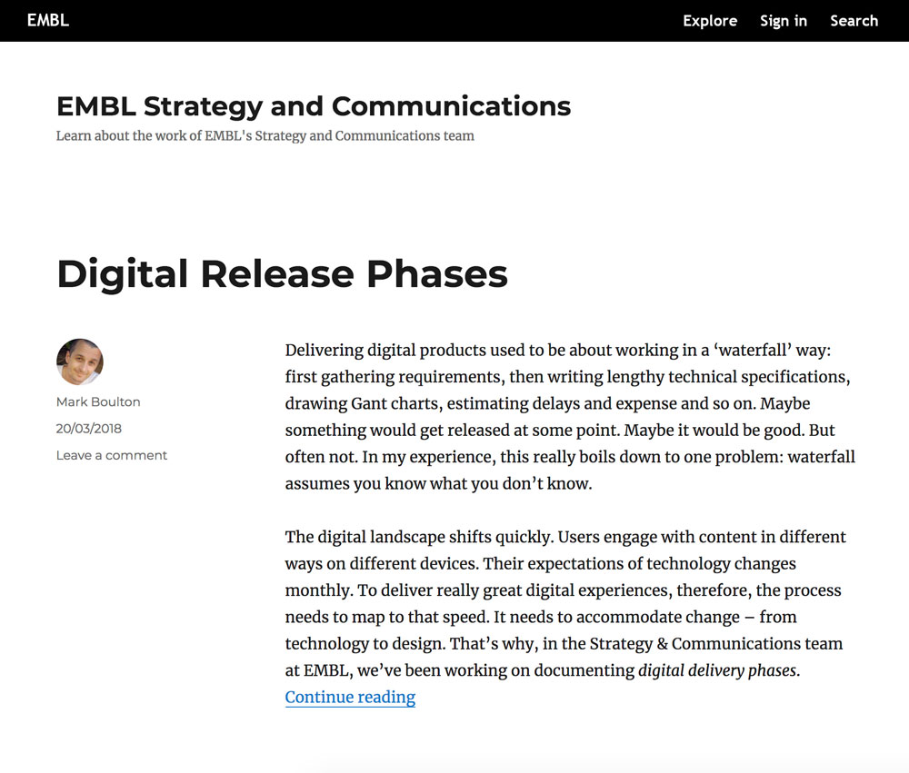
I worked with Mark to hash out ideas for a unifying branding element for EMBL’s various websites. We thought that a toolbar across the top of EMBL’s webpages could work well.

An EMBL toolbar could provide the following functionality:
A branding element for EMBL
The “EMBL” at the top of the screen in the toolbar, with the full logo relegated to the bottom right of the screen, as a badge. This frees up the space at the top left of screen – below the toolbar – for sub-branding such as “EMBL Rome”, “EMBL Grenoble”, “European Bioinformatics Institute” etc.
A link back to http://www.embl.org
Users always have a way home if they get lost or confused navigating EMBL’s subdomains.
An “Explore” link for external users
This could provide simple, clear navigation to commonly used EMBL sites: Topics / Themes / Locations / People / Research Groups / Jobs / Contact…and so on. Links will be chosen based on analytics from existing EMBL sites.
A “Sign in” button for internal users
A Single Sign-On system from the toolbar could take EMBL users to a “Springboard”; a personalized, curated list of important intranet links, chosen based on user needs.
A working Search function
In early user research for EMBL’s digital projects, the most consistent feature request from users was to fix Search. It should be easy to find anyone or anything at EMBL from a toolbar search.
Ken spent the day building a prototype toolbar, which helped to focus discussions.

Next steps
We will be integrating these and other design ideas into a wider EMBL design language. Branding for EMBL is a work in progress and we will no doubt iterate and change some of these designs along the way. Watch this space and post a comment if you have any questions.