Adhering to our principles in latest corporate design sprint
Joint blog post by Ed Dadswell and Tabea Rauscher
Our latest Corporate Design sprint was intended to bring us closer to our goal: develop prototypes and examples of how the EMBL master brand could be implemented across products.
The kick-off meeting made it clear that we should keep our design principles in mind, especially the keep it simple idea. Simple in terms of structure, simple in terms of process, and simple in terms of making the content accessible and targeted to our audiences.
We created a table of contents and a strategic concept for each of these brochures:
EMBL Annual Report: This product is primarily intended for funders, in particular for Council delegates to share with their science ministries. The Annual Report should show progress towards the stated goals of the EMBL Programme and provide a financial update.
EMBL-EBI Annual Scientific Report: This product is primarily intended for EMBL-EBI’s funders and to support the SAC review. It should address a scientific audience.
EMBLetc.: This product was originally a bi-monthly staff newsletter, but since its 2014 redesign has had a broader community focus, including alumni. We aimed to develop a concept where EMBLetc. could inspire a number of audiences, including staff, potential recruits, alumni, and funders. The new magazine should sit well with the other publications above.
We wanted to show the same collaborative approach in this blog post that worked so well in the sprint, so we’ll answer the same questions from our individual perspectives. Ed answers on behalf of the content team, Tabea on behalf of the design team.
What is your aim when it comes to creating a strategic concept?
Ed: The most important thing is to find an engaging way to give people the content they need. Even if someone is reading a publication like the Annual Report or the EMBL-EBI Annual Scientific Report purely to find out certain information, we’re missing an opportunity if we don’t also aim to communicate with them in a meaningful way. And with a publication like EMBLetc., we want to show people the inspirational side of EMBL and the work we’re doing here. We need to think carefully about our audiences, so that we give them the right information in a way that is useful to them as well as inspiring them.
Tabea: The main goal is to make sure that we keep our design principles as well as the overall visual framework in mind. Especially its performance on digital channels. That means thinking about page flow, visual engagement, emotional impact, and appealing images.
What was your main focus during the sprint?
Ed: We thought through our aims for each of these publications and planned out their content, including suggested word and page counts to assist the design team in creating prototype layouts. We considered the kinds of formats we should be using in each publication and how they fit with audience needs.
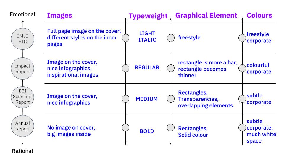
Tabea: The goal was to design page navigation, page numbering, image style, graphical elements, divider pages, and font hierarchy. The specific design features and different application on the three brochures are basically the first steps towards a holistic visual language.
Last but not least: show, don’t tell

In order to feed the strategic outcome into our visual framework, we started to work on a scheme, which can be applied on different channels. This is basically the start of a visual calibration linked to our user centric approach.

As always, we applied some of the strategic ideas on covers, this time for each of the brochures:


Summary:
Ed and Tabea: We created a table of contents for each brochure, including types of texts and rough pageflow. It was clear, that – in general – texts should be shorter, visuals more emotional, and content more inspirational. Both teams are now ready to plan next sprints in their specific fields.
Thanks for all your contributions (in alphabetical order): Roberto Aarnio, Iulia Cartasiova, Spencer Phillips, Oana Stroe.