Faster scientific websites through reusability
Growing an EMBL-EBI solution into a Visual Framework for the life sciences
Building a website is easy. Building a good website is trickier. Building that good site quickly is hard. And if you want a beyond-hard challenge, also match your organisation’s look, feel and brand requirements.
Fortunately there are many tools out there to help solve some of these problems.
Take the popular frontend toolkit of Bootstrap: in 2010 Twitter saw that many web developers were solving the same problems when building website — tabs, nice looking forms, menus and so on — and provided a drop in solution with sane defaults.
Bootstrap continues to be a huge success on the general web, including for life science websites.
So it’s not much of a surprise that in 2015 at EMBL-EBI we decided to mirror the Bootstrap approach to make a reusable “EBI Visual Framework” to power EMBL-EBI sites and life science services, such as InterPro.
- Reusable, structured CSS, JS? ✅
- An attached pattern library? ✅
- Sane defaults for new websites? ✅
- Make the EMBL-EBI look and feel more consistent? ✅
- Provide versioned upgrades to the tools, EMBL-EBI look? ✅
- Job done? Almost.
Problem (not quite) solved
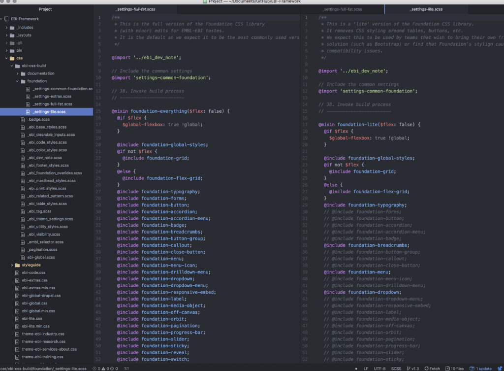
The EBI Visual Framework in many ways did what it set out to do and those success came from mirroring the philosophy behind Bootstrap and similar tools. But there are some challenges which are a little unique to our environment where the Bootstrap-style philosophy breaks down:
- ❌Run everywhere, with everything?Within EMBL scientific teams are free to bring their own technical solutions to their problems — that means the EBI Visual Framework has to run across a variety of front ends (Angular, React, vanilla HTML) and it also needs to run alongside other solutions, like Bootstrap. All of this is possible, but it is often messy; example: which framework should style your
.buttonelements?

- ❌ Easily add your own patterns, tweak existing patterns?
We provide a wide set of default patterns for tabs, buttons, tables, dynamic lists — but when a team wants to bring their own pattern (or not use a pattern) there is no seamless way to do so. - ❌ Use the functions, without the EMBL-EBI look?
Much like Bootstrap, the EBI Visual Framework looks a lot like its parent organisation. From an evolutionary perspective, this makes sense. But we have internal teams that want to reuse our tools but due to good reasons can’t look too much like EMBL-EBI, or they do not need large chunks of JavaScript that implements EMBL-EBI specific features.
Take 2.0
Now in 2018 we’re improving the Visual Framework by learning from those lessons.
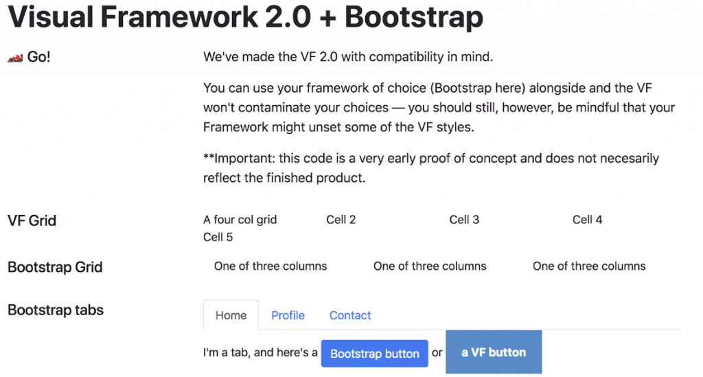
- ✅ Run everywhere with everythingThere’s an ever-increasing diversity of frameworks in use by teams across the organisation, so we’re building with compatibility in mind. CSS styles aren’t bound to HTML elements (
<p>,<h1>), instead they’re namespaced (.vf-header). This means the framework is fully opt-in and is designed to not “cross-contaminate” Bootstrap, or other popular options.

- ✅ Add your own patterns, and tweak existing patterns
We’ll use the Visual Framework to create drop-in styling for EMBL websites, but the Visual Framework itself isn’t a finished product, rather it’s a tool in an npm project — and that makes allows for easy control over versions and mixing in or removing patterns. - ✅ Bring your own look, functions
Building on the above, out of the box the Visual Framework 2.0 will give you a bare bones look. You can then add your own design tokens to style the look and customise your build process to bring in your custom functions and patterns — that’s what EMBL will be doing, implementing its own visual identity* atop the Visual Framework.
* We’re expecting to have a few layers to the EMBL look, tied specifically around portions of the organisation and needs of the content, such as a more white-space driven look for information about EMBL and a more dense, meaty look for scientific information.
This also means the Visual Framework will be able to go from an EMBL-EBI solution to a pan-EMBL solution. That’s because the Visual Framework is not only more compatible, it’s more flexible.
Instead of a quick way to implement one look and feel, the Visual Framework is a way to quickly implement the look and feel needed for your content, data, users and organisation.
What’s next?
This post is big on philosophy but short on technical details. That’s partly because we’re still evaluating options and are heavily developing the fundamentals. However, I did mention a few key concepts: design tokens, npm-based patterns, namespaced styles that aren’t bound to HTML elements, and we’ll also be supporting React, Angular.
Again, more on that to come soon. If you’re particularly interested in helping, curious or just concerned, drop an email ken.hawkins@embl.de.