On Book Making
Hi, I’m Sarah, a design trainee from Australia who has been on the EMBL design team for 7 months now. For the past few months i’ve been working on the EMBL Teenager activity book. This book is just one example of the variety of projects the design team takes on.
Creating something from scratch, especially when you barely remember anything about the topic for the book, requires quite a bit of research. The first step I had to do to ensure everything would make sense and not turn science into full-blown science-fiction, included a trip into the world of “Molecular Biology for Dummies”. Making notes and watching explainer videos one after the other on repeat (I’m still not convinced I fully understand translation), I was eventually able to figure out a way to merge this factual information with story telling. The world of DNA is complex and choosing what to omit and put in was a process in itself.
After the DNA research phase, I proceeded to explore the visual side of things and compile a mood board for the direction I aimed to go in. Focusing on specific imagery and a minimal colour palette, I wanted to capture the target demographics (teens ages 1-16) attention. Style plays a big role in this, I wanted to create something that was cute and edgy at the same time, something not too complex to draw within time constraints and also not too naïve looking.
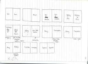
I usually create some very quick thumbnail sketches of the layouts to see the flow of the story.
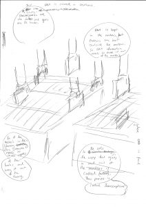
Then I make the first draft of the pages in pencil with very rough sketches of the panels, speech bubbles and characters.
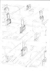
The second draft involves more refined pencil drawings that are ready to go over in pen/ink.
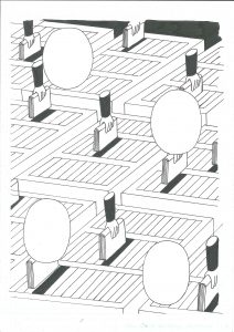
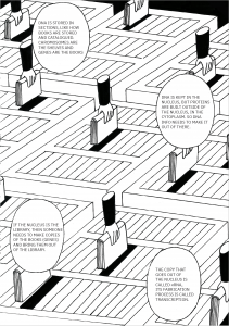
Usually when you go straight from scanner to screen the image will not be as dark or crisp as you would like. Touch ups in Photoshop, playing around with contrast levels and transparencies ensures a cleaner image.
Meshing activities within the story whilst trying to remain relevant became quite a challenge. Especially as I didn’t want the story to become one big long explanation of every single process from DNA > Protein. When I realised that there needed to be more information involved I decided it would be best to keep these as infographic based activities.
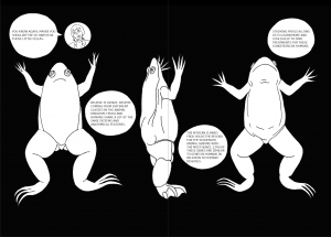
Something that separates comics from other mediums is the inclusion of text and image together. This relationship between the two, much like graphic design, opens up a whole new world of how a story can be told. In linguistics it has been shown that readers read comics in a way that is different to that of reading a text based novel. Comics have remained popular among adolescences due to this distinction, especially for those that dislike reading. The order and direction that panels are read are dependant on different factors including layout, size and shape. In creating these layouts I wanted to combine traditional methods of visual storytelling with more experimental ones. I felt that having square panels on every single page can become a tad stagnant.
Visual story telling can be an incredibly helpful learning tool across all disciplines whether that be science, art, literature or whatever really. It evades the verbose and allows for experimentation. I hope to continue creating more stories and narrative driven design in the future!