Accelerating one EMBL.org
On 4 December 2020 the new EMBL.org received a package of major refinement. Driven by stakeholder desire for a shorter version of the page, the outcome is greater focus on EMBL’s mission areas.
But this is more than a cosmetic overhaul, it has further ramification — and the new EMBL.org architecture has much potential for One EMBL.
First: Here’s how we got there
A major focus was content, to shorten the length of the page and remove general-purpose content to focus on EMBL’s mission areas and major offerings.
A look at some changes:
Tightened text


More focused links
After.
A more compact layout
Some content was removed
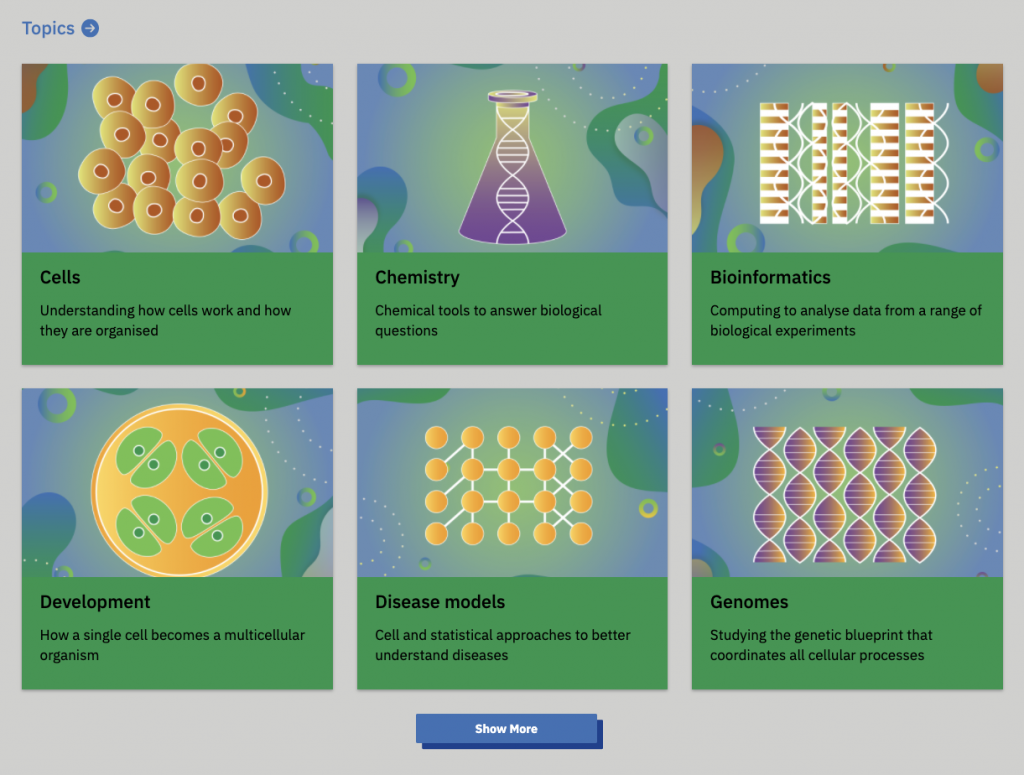
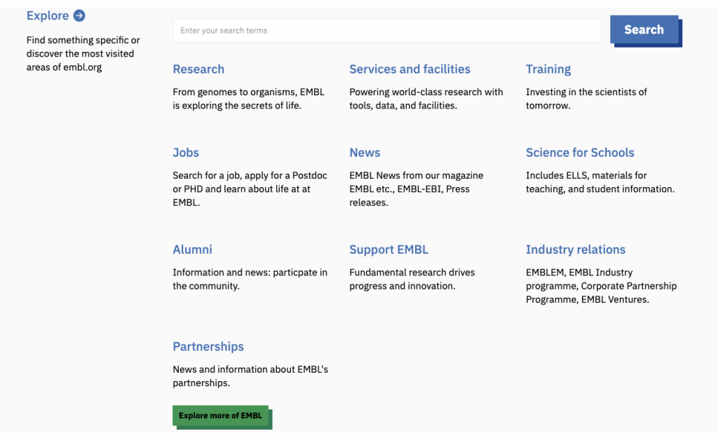
New top-level navigation


But these edits were more than just text.
Crossing the white space wall
These changes were not done in isolation. Content changes were paired with visual modifications to reduce the amount of white space, refine typography and improve functional elements like buttons, navigation and search.
Less padding inside elements
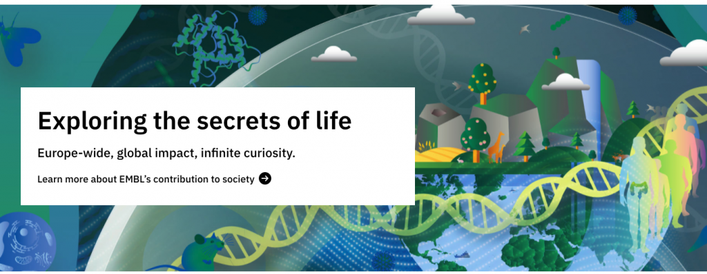

Cleaner presentation
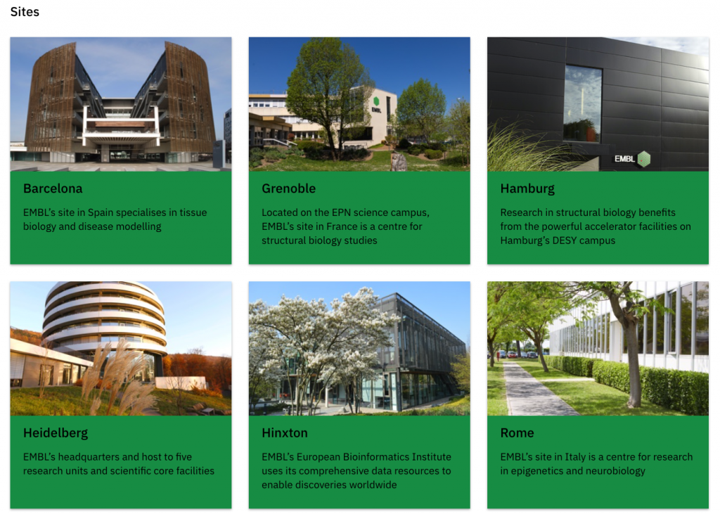
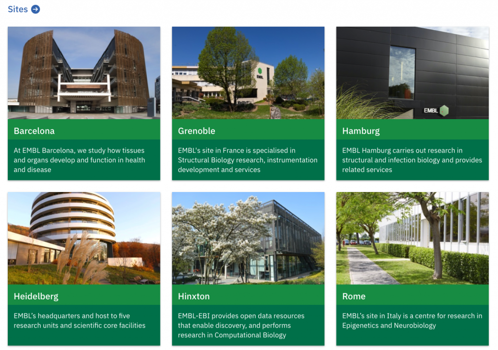
Less spacing between elements


These visual changes were made in consultation with EMBL’s design teams and stakeholders and impact beyond the EMBL.org “corporate” pages.
The changes integrate into a shared design system tool that we call the Visual Framework 2.0. The tooling is used across EMBL.org for its jobs, news, microsites, as well as with non-EMBL.org projects that might share only portions of the EMBL.org brand, such as the EMBL-EBI Training prototype and COVID19DataPortal.org.
Did you know?
Today’s Visual Framework 2.0 began its 1.x life at EMBL-EBI where we learned many lessons about the needs of our community.
Not just An EMBL.org, but One EMBL
The Visual Framework means all sites benefit from the work to improve visuals, functionality and tighten white space — but it also means that we remain cohesive as One EMBL.
The Visual Framework is a service that is no small undertaking, but it is one that will allow us to make a better EMBL.org and forge a more unified EMBL across its collaborations — and allow us to show how EMBL leads in the life sciences in online functionality.
Why a Visual Framework?
The Visual Framework is a front-end toolkit allows us to quickly and collaboratively build performant and consistent life science websites regardless of branding or technical solution.
In short, it allows us to build better websites faster.
It does so by reusable web styling (CSS), some interactivity (JavaScript) and templates (both technical and guidance).
A key unique feature is flexibility regardless if a site need use the EMBL logo, different colours or different technical solutions. It has been conceptualized with considerations around challenges when cheating life science websites.
Compared with common web tools like Twitter’s Bootstrap, is the Visual Framework won’t break your existing functionality. That means we can build a highly focused EMBL.org and that we won’t break the technical functionality of an existing service that might be using Google’s Angular and Bootstrap.
Reuse of our common Visual Framework tooling means we’re able to accelerate the development of other projects and get a greater return on the investment made. It also allows our collaborations to share their lessons learned to improve the technical and user experience functionality of forms, buttons, tabs and navigation.
In an open-source and open science fashion, what we do and learn creates a holistic circle to allow our peers to help us.
The Visual Framework is another way for EMBL to leverage its role as Europe’s leading life sciences laboratory by helping the community collaboratively develop better services more efficiently.
This is good, but we’re not done yet
Content changes will evolve as EMBL’s needs change and we can better measure our effectiveness — and the Communications Digital Team is still very busy migrating content and functionality from the existing EMBL corporate websites.
The Visual Framework will also continue to grow as our needs evolve and web technology matures.
Both the EMBL.org platform and the Visual Framework technology provide us with the opportunity and technical means to communicate and present EMBL as a cohesive single global leader.
Keep an eye on EMBL.org, this blog and the Visual Framework as we continue on this journey.