The power of the ‘one EMBL’ unified brand
What is the purpose of EMBL’s corporate design, our brand strategy, and the principles that make EMBL a design leader?
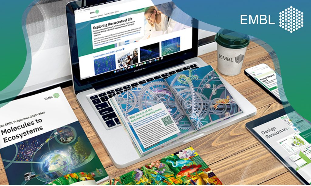
Credits: Creative Team/EMBL
In the contemporary world, digital landscapes dominate and visual identity plays a pivotal role in an organisation’s identity. A comprehensive and cohesive corporate design is crucial to strengthening connections with global audiences, fostering unity, and enhancing visibility across all communication channels.
Corporate design goes beyond aesthetics. It involves the strategic use of logos, colours, typography, and other design elements to create a unique and recognisable presence for an organisation. This visual identity acts as the interface that facilitates audiences’ point of contact with an organisation, shaping their perceptions and interactions.
Purpose of EMBL’s corporate design
The EMBL corporate design aims to achieve several key objectives:
- Facilitate identification: Make EMBL instantly recognisable to a diverse global audience.
- Differentiate from others: Visually distinguish EMBL from other institutions in the field of life sciences and specifically molecular biology.
- Create a coherent design system: Ensure consistency across all platforms, whether digital or print, to strengthen the brand’s message and streamline internal workflows.
The ‘One EMBL’ brand strategy
With the introduction of the ‘One EMBL’ brand in 2019, the organisation set a clear directive: to ensure EMBL’s six sites across Europe are recognised as a unified entity. This strategic direction was given by EMBL’s leadership, recognising the need for a strong, overarching ‘One EMBL’ brand to present our diverse activities. Under this framework, all communications should be branded as ‘EMBL first’ and, if necessary, sub-entities such as sites or projects can be expressed after the parent brand.
Key Design Principles
The creation of the ‘One EMBL’ brand was guided by several fundamental principles:
- Sustainability: creating efficient, reusable, and scalable systems for long-term impact. This ensures broad reach and environmentally responsible practices, enhancing the brand’s impact.
- Simplicity: helping make user interactions straightforward despite the underlying complexity of EMBL’s activities and audience.
- Unity: integrating activities and collaboration across the institute, ensuring that physical, digital, and environmental designs are synchronised and coherent
- Consistency across channels: ensuring holistic communication and helping embed the design nomenclature within the EMBL community, fostering a common language and understanding.
These principles are designed to guide EMBL’s design strategy, ensuring it remains innovative, functional, and inclusive.
EMBL’s corporate design framework
To embody these principles, EMBL developed a corporate design framework that includes:
Logo
The EMBL logo is protected under the Paris Convention, which protects names and logos of intergovernmental organisations.
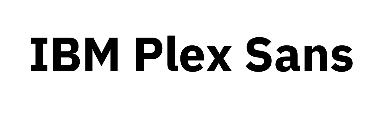
Typeface
Our standard typeface is open source, eliminating licensing issues and optimising for screens. It features excellent legibility, supports multiple languages, and offers a wide variety of symbols, catering to diverse design needs and ensuring consistency across all communications.
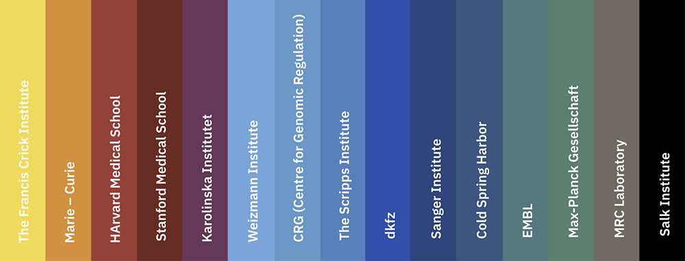
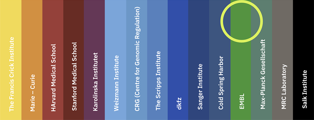
Colours
These were decided based on the colour balance of research institutions working in similar fields. EMBL is now the only institute in this research field with vibrant shades of green as our primary colour.
Previous
Current
Design System
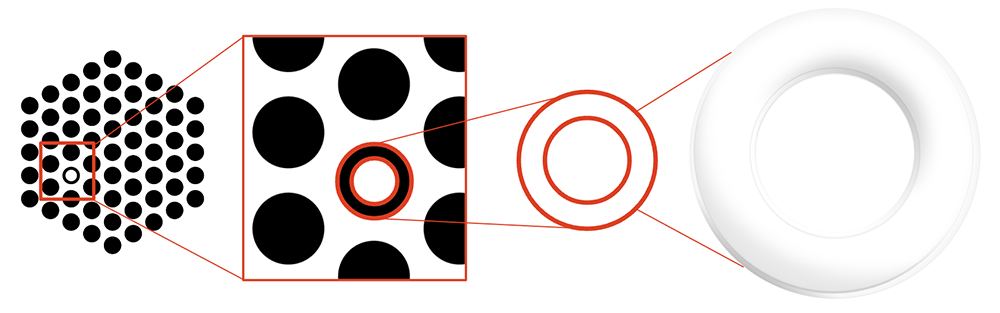
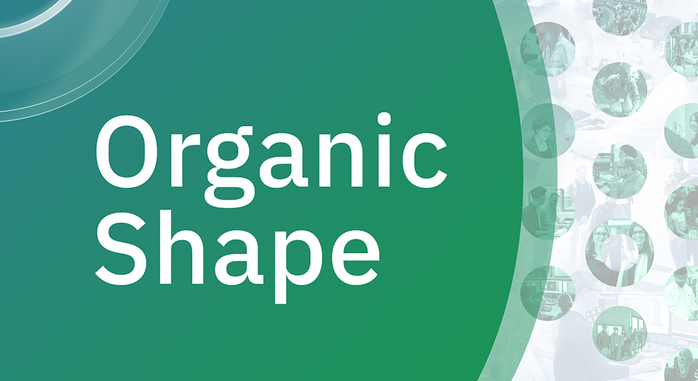
The ’roundel’ is specifically derived from the hollow monochrome circle replacing the red solid circle in the coloured version of the image mark. The organic shapes are designed to reflect organic life and structures in an abstract form.
Roundel and Organic Shape
The applied visual strategy is the ‘atomic design approach’: all visual elements are based on the smallest graphical denominator, which is the EMBL logo.
Implementation and impact
The implementation of this new design system, which began in 2019, marked a significant shift in how EMBL communicates with its various stakeholders – from researchers and collaborators to the general public. A strong visual identity will raise EMBL’s profile to support achievement across EMBL’s missions and the delivery of the EMBL Programme.
The ‘One EMBL’ design framework also simplifies internal design processes. The provision of bespoke EMBL templates and assets along with the brand framework
enables staff to create outstanding visual materials – from scientific posters to social media posts – that support the recognition of the EMBL brand.
The EMBL Creative Team, part of the Communications team, efficiently manages up to 150 requests per month and supports staff training, ensuring consistent communication and empowering employees to produce impactful, accessible, and excellent visual output.
Conclusion
EMBL’s adoption of a unified brand under the ‘One EMBL’ initiative is a fundamental realignment of how we visually present EMBL to the world through a thoughtful and inclusive approach to corporate design.