The smarter way to find bioinformatics training
The EMBL-EBI Training website is the first port of call for many life scientists, bioinformaticians and computational specialists looking to further their knowledge of the field. We’re proud to offer world-leading bioinformatics training to users across the globe, with over 600,000 visitors to our online courses alone each year.
Now more than ever before, we see the need to make our training easily accessible, visible and findable so that anyone, regardless of location, career stage or experience of training with us can find the resources they need.
We’re therefore very pleased to be able to introduce to you the brighter, smarter way to find bioinformatics training from EMBL-EBI.
What’s new?
- Find relevant training more easily, in the format that works best for you
- Flexible free-text search based on EMBL-EBI’s own search engine
- Combine search and filters to quickly identify the course you need
- A modern, clean look and feel with simple navigation
Site tour searching our virtual courses
Site tour searching our recorded webinars
How did we do it?
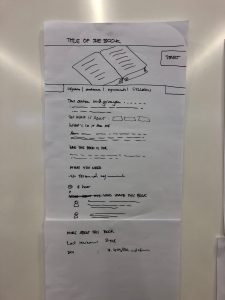
This project officially began in April 2019, when we discussed the brief and set things in motion for the next 12-18 months. Little did we imagine that an idea sketched out on a plane journey from London to Amsterdam in early 2019 would lead to such a large scale project. We constantly review our engagement with users and potential trainees, enabling us to think about how we can better provide the content and course information they will be searching for. This in turn enables us to remain world-class leaders in what we do. From the start we were led by user feedback and web analytics in order to define where improvements were needed.
The main purpose of this project has always been to enable and encourage you (our users) to engage with all our content and put the training into your (virtual!) hands.
We needed a new interface that works for a diverse user base, regardless of research needs, scientific interests or career stage. Given that we offer a mix of live training and on-demand content (freely accessible, anytime), this was always going to be a task requiring a lot of man-power from across the organisation to make it the best it could possibly be.
Team creation and adoption of agile methodology
Our ongoing collaboration with the EMBL-EBI Web Development team has been crucial to getting us from concept to a final product. They have not only provided us with several talented developers who make our ideas come to life on the web, but also user experience (UX) experts, who have helped us explore what our users really need.
We began the project with a plan to implement agile scrum methodology as our guiding framework, which was new to many members of the project team. As such we worked in two-week ‘sprints’ where the team would focus exclusively on the project, maximising efficiency and creating a potentially releasable product at the end of each sprint.
First steps
Our first task was to redesign the courses in our Train Online catalogue, our freely-available library of online tutorials. We took one of our most popular courses, called Bioinformatics for the terrified, and soon released a live BETA version for our users to try out and provide feedback to guide us as we worked on other course types and pages.
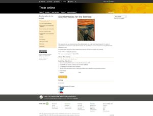
If you have used our website regularly, this image will look pretty familiar to you. This is what the team started with at the beginning of the project.
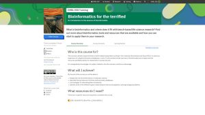
We then moved to this updated design which you can see looks very different from our old course pages. This is where the design really took off and we used this as a base to make other minor changes which took us to our final design which you can see below.
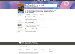
Here it is, our final design. The layout and functionality remained largely the same from the first design based on user feedback, but we updated the graphics which you can see in the page header. Read more about the background behind the graphic changes below.
Design
The users and the EMBL-EBI training team gave very positive feedback on the layout and functionality of the new online course pages. However we quickly realised that we required some design expertise and our colleagues at EMBL Design were brought on board to assist with providing beautiful new graphics for the page headers. We also utilised the EMBL visual framework to create a look that was coherent and consistent with other pages in the wider EMBL brand. The EMBL visual framework is what provides the building blocks of this new look and feel.


New event pages
We followed up the creation of the online courses by implementing similar design and layout changes to our live courses. We gradually began to make the switchover with both upcoming live events and our extensive back catalogue of on-demand materials.
What’s next for the project?
Two years on, the whole of the EMBL-EBI Training site has been redesigned and deployed following an iterative and user-centered approach. We are thrilled to be able to release this to you – our users – so you can benefit from the new look and functionality.
Our hard work doesn’t stop now. Next up, we will be looking to enhance your experience even further by enabling you to track your personal progress, and enhancing the way you access past content to help you continue your learning journey with us.
Acknowledgements
We’d like to thank all those that have been involved in this project from across the EMBL and EMBL-EBI teams, as well as you (our users) that have feedback across the journey.
Special thanks go to Adam Broadbent, Ajay Mishra, Anna Swan and Sarah Morgan from the EMBL-EBI Training team, to Nikiforos Karamanis and Prakash Singh from EMBL-EBI Web Development team, and to past team members Melissa Burke and Joseph Rossetto – without you, this project wouldn’t be the success it is today.
Photos from the project
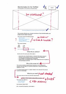
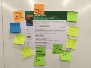
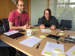
Here are a few snaps from the project along the way.
