Choosing the best layout for your CV
The layout of your CV makes an immediate and lasting impression – ideally that, like your CV, you are organized, logical, focused and easy to interact with. One of the most important aspects of your CV is therefore the structure and formatting. This article focuses on four questions to ask yourself when selecting or creating a layout for your CV.
1.What type of position are you applying for – what are the CV norms?
Your job application should show your personality and attract the attention of the reviewer, whilst still fitting the expectations and norms of the industry you are applying for. Rather than using a pre-made template, we recommend finding inspiration from different CVs online, and then creating your own template.
For academia, a simple, clear CV with comprehensive information about your research experience, funding, publications, teaching, presentations, service, and – for postdoc / similar roles- technical skills is normally expected. You can find example of academic CVs online (e.g. from UCSF career service – real, anonymized CVs for US faculty / postdoc roles) and in many books (including the The Academic Job Search Handbook by Julia Miller Vick, Jennifer S. Furlong, and Rosanne Lurie [University of Penn Press, available in the EMBL library]). An article from The Guardian newspaper highlights some of the common mistakes to avoid.
For non-academic positions, there is a little more flexibility in the CV format. When creating your CV template, consider the things you want to highlight from your own unique career path; don’t, however, compromise on an easy to follow, logical structure (see next point). Do also remember that the CV may be viewed both on screen or printed in black and white. Additionally, be careful about including info graphical elements: these are attractive, but often lack a frame of reference (e.g. if you rate your python programming as 3/5, what does this mean about your skill-level?). For inspiration, consider asking contacts who have already made the transition into the area you are targeting if they would be willing to share their CV. You can also look at what people in this area focus on in their LinkedIn profiles. Some sample CVs are available from the UCSF career service and there are also numerous general templates available e.g. in word, google docs, overleaf.
2. Is the structure of the CV clear and logical?
Good structuring includes visible and descriptive section headings, use of white-space to group related information, and a logical ordering of information (reverse chronological order for time-sensitive entries [positions, publications etc] and most important things first for other entries).
An eye-tracking study by a CV-writing consultancy, confirms that if a CV is poorly constructed the recruiter spends less time reading the CV, with most of that time spent looking at job titles and headings and almost no time spent reading past the first page. In contrast, if a CV is well structured, recruiters will spend longer reading the CV, and they will read more of the details, including information from a second page.
See: the eye-tracking study mentioned above (external) and (within EMBL) career service handouts e.g. on academic & non-academic job applications, which include a list of possible descriptive headings.
3. Do formatting elements highlight the key information?
Bold, italic and underlined text can help draw the reader’s attention to specific points in your entries. If overused, however, the layout can feel cluttered, and the reader doesn’t know where to look first. Inconsistent use of formatting also can make your application look messy. You should format all entries of the same type identically, and there should be a similar “look” to all types of entry.
4. How much do I want to emphasize transferable skills?
If you are applying for non-academic positions, your transferable skills such as leadership, communication, teamwork and organizational abilities are important. You can include evidence of these in each section – e.g. in the research experience section you would include additional activities that you did in these roles that show relevant skills (see our post on impactful statements). Alternatively, you could keep the research sections shorter, and include a separate section where you group examples from different parts of your CV under the key skills needed for the position you are applying for.

5. How easy will it be to adapt the information provided for the next application?
As mentioned in our previous article on industry CVs, it’s important to focus on the key details for the position you are applying for. This means that you will have to make at least minor changes each time you re-write your CV. For example, if you are applying to an industry position, you would want the technical skills needed for the job to be high up on your list of technical skills. If you have a profile section in your CV, you would want the most important of these reflected there too.
Bullet points don’t just break up the text, making it easier to read, but also make it easier for you to tailor your CV. You can keep a “master” version with different bullet point options and then choose and adapt the most relevant ones for each application.
Bringing this together
Taking the example of the research experience section of the CV, compare the following two examples.
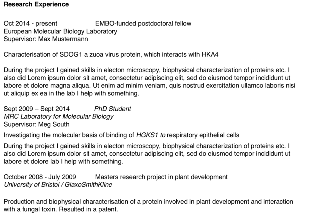
Poor structure / formatting – research experience section

In this example:
- the information is poorly grouped, it’s not immediately clear what information belongs together
- the most important piece of information for the context of an experience entry is what type of position it was – this is floating on the right-hand side of the page
- it’s unlikely that the reader will read a full paragraph of text until they have decided whether you are a strong candidate, and you will have to completely re-write the paragraph for each new application
- the research topic is seperated from other text, and therefore stands-out.
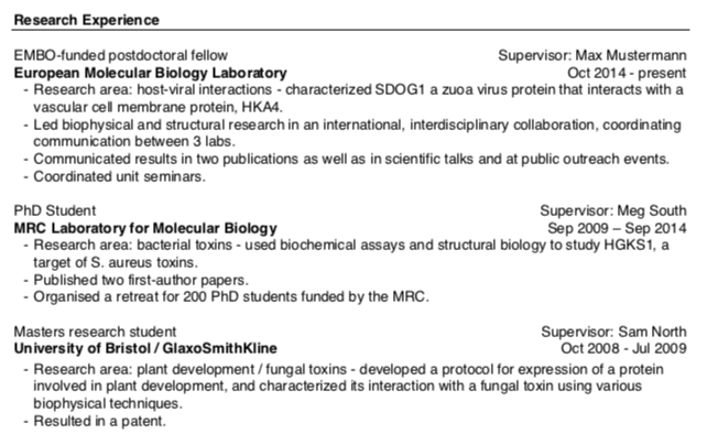
Better structure / formatting – research experience section

In this example:
- the section heading is very visible – a line has been used to differentiate the headings from other bold text. You could use caps, larger font size etc for this.
- the information about each position is clearly grouped
- the type of position is the first piece of information, allowing the context to be immediately clear
- the institution is highlighted in bold to draw additional attention to this information.
- depending on your unique selling points, you can decide what piece of information you want to highlight with formatting. For a research role closely related to topics you have already worked on, you might for example choose to highlight the research area.
- all key information is all on the left, so it is easy for the reader to simply scan down the left-side of the page.
- the information is split into bullet points, making it easier to quickly see what the person has included in the details (info on the research + info about activities demonstrating achievements / skills). If they are interested in the research area, or communication they can read those bullet points.
- information about the broad research area is provided, giving a better high-level overview of the person’s research interests. This is followed by more detailed information on what the person did in the project. See our separate entry on crafting impactful statements for more information about the techniques that can help show your roles in projects and the associated skills.
- in this example, only very broad information about scientific techniques has been included – if the specific techniques are relevant for the role being applied for, this could be added, or in a separate “technical skills” section.
This provides just one suggestion of how to organize this section, there are many possibilities, each with their own pros and cons.
Relevant resources:
- Other articles on job applications from this blog
- (within EMBL) career service handouts
- NatureCareers academic and nonacademic toolkits
- UCSF and UPenn sample CVs
- Blog post from @akrook on describing your skills in a cover letter
- Jobs.ac.uk article on identifying your unique selling points
