Design thinking
EMBL’s Design Team Lead on translating scientific discoveries into visual designs
By Mariana Alves
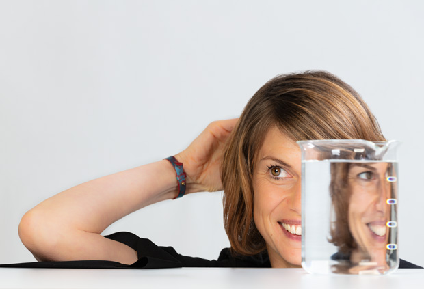
Tabea Rauscher has led EMBL’s Design team for the past two years. As well as helping scientists find inspiring ways to present their research, she’s working to build a more consistent visual identity for EMBL as a whole. Here she reflects on the process of applying design-led thinking to scientific concepts.
Why is it that humans feel so connected to visual cues when explaining or understanding complex concepts?
Research has shown that people remember approximately 10% of what they hear, 20% of what they read and 80% of what they see. Our eyes are so good that we can grasp a visual scene in less than one-tenth of a second. My job is to make sure that people understand complex content. There is a responsibility for every designer to make sure the correct message is conveyed. As visual input generates emotions in us, we always need to be careful about how these images are perceived within a cultural and social context. There is this idiom: a picture is worth a thousand words. And that is what I want to make sure I achieve, with every visual I create.
When translating a scientific discovery into a visual design, what is your process?
I think the best designers are listeners as well. So I listen, then I try to learn and understand. After this initial phase I do some research, and eventually I’ll check what other designers have created in similar or different fields. After this more inspirational phase, I go into the second phase, which is more output focused: we brainstorm, ideally in a team of two to five people, and decide on two or three concepts we’d like to follow. We then go back to the scientist and discuss which concept is the closest in terms of scientific content. If this is approved by the scientist, we start the final artwork and go into depth and detail and make it really visually appealing. Over the years, I’ve learned what questions need to be answered to create a focused and tailored output.
Do you think designers need scientific training to be able to ask the right questions?
They need a basic understanding of scientific processes that they either bring with them or learn by themselves. But every paper is so specific that even a trained scientist would need some time to go into detail and understand all the research.
When you study a paper, do you ever realise a figure was not designed in the best way and give constructive criticism to the scientist?
Yes, and I offer scientists training in both general design and creating graphical abstracts and scientific figures. I also offer design consulting two days a week, where scientists call via Skype or just walk in and I’ll give them feedback.
What is the most important design rule that scientists should have in mind when they compose their figures?
The main one is visual hierarchy, so make sure relevant content comes first. Make the relevant content big. Be clear about a grid and structure, how you convey the information. Be aware of colours – in a cultural context as well. Be aware of the readability of your text, so it shouldn’t be too small or too big. Less is more. And be aware of the difference between complex and complicated. So think first, and then create.
Where do you get inspiration from?
I mainly get inspired by meeting people and friends with different professional backgrounds, going to museums, watching movies, attending conferences, just being a social person – social networks in general. I think good and bad experience is a source of inspiration as well; you connect those experiences with something new in order to create something outstanding and appealing. Plus we’re all curious and enjoy what we do. I think I can speak for the whole Design team at EMBL: we all love what we do and that’s the best source of inspiration!
What is your preferred biology field, theme or organism to translate into visual designs?
If you’re a designer in your heart, it doesn’t really matter what kind of field you’re working in, as long as you’re curious, as long as there’s a story to tell, as long as there’s relevant content. For me it’s just amazing and motivating to understand the content and take the responsibility as a designer to make the complicated and complex data somehow accessible to people – to translate it into a language that everybody can understand or that is understood by the specific group we would like to communicate with.
What are the challenges of translating scientific concepts into visual form?
There are basically two main challenges. One is timing, so good design really needs time. That’s definitely one big challenge, as well as capacity. If we don’t have capacity within the team or if we need a specific skill, for example a specific rendering skill or a machine, we try to work with freelancers who can support us to make sure we have something outstanding.
The second challenge is content. I wrote a blog post about that on the Strategy and Communications blog: how much can you change a scientific figure to be visually appealing and still be scientifically correct? That’s a big challenge, especially for cover pitches. We do a lot of those and the way we approach it has been quite successful. It’s a lot of fun and quite motivating as well, we really put all our ideas and thoughts into it, and it’s a team effort – including the scientists. That’s what I love about cover pitches, it’s highly interdisciplinary.
How would you represent EMBL in one shape, form or image, different from its logo?
That’s a tough question! But I think it should be a dynamic network. Visualisation of networks and data is an important part of design – information design anyway – and this type of network is highly dynamic, quite colourful, and very appealing to a wide audience.
How important is interdisciplinary work at EMBL?
Designers love to think, that’s what we do all day. There is this outdated idea that designers spend their time moving pixels or switching colours. I really like the Design Thinking approach. This is based around the idea of bringing together people with different professional backgrounds – all of them talented, open-minded, curious and motivated – to explore something new in order to advance society. For me, that’s joyful and motivating every day.